Tuesday 8 December 2015


Here i did drafts for what my music magazine may potentially look like. There are two front covers, of different layouts and with different mastheads so I could see what ones worked better, and their contents pages. I used Indie Magazines from my research for reference on designing these drafts so that they would look more appropriate, and it has helped me to decide on what masthead and layout I prefer.


Monday 7 December 2015


masthead


here i did the chosen masthead font (Agency FB) and tried it out with colours that are normally associated with my chosen genre. I got the colour scheme ideas from magazines within the same genre, and just ones I thought were appropriate and would be more compatible for my target audience.

Thursday 3 December 2015

TEMPLATE IDEAS FOR MY MUSIC MAGAZINE


among the template designs are three front covers, three contents pages, and three double page spreads. All of these ideas will help me to design my final magazine, as a layout is crucial for a magazine as it can either make the magazine look messy and unprofessional, or it can make it look neat and intriguing for the target audience.

MASTHEAD IDEAS FOR MY MUSIC MAGAZINE

Monday 23 November 2015

House Style:

This is when a magazine uses a specific layout and structure.Such as the masthead, this is always the same on the magazine so that the audience are more aware of what it looks like and so it is more recognizable. This masthead is always in the top center of the magazine, and can sometimes be overlapped by the main image which is done to give more focus to the image to entice the target audience into buying the magazine, and  the magazine title is recognizable so it doesn't always have to be on full display anyway.


however, the masthead does sometimes change. It can be seen to have a drop shadow or a different colour, which is done to suit the theme of that certain magazine and the artist (to make it stand out more), but the font is always the same. Having the font the same keeps the professional look, as a constant change would make the magazine look messy and less identifiable.

the main image has the artist looking directly at the camera (direct addressing), which establishes an interaction with each reader, making it more personal. 

Sunday 8 November 2015


my results from survey monkey about my school magazine show that the majority of my target audience would want the school logo to be included somewhere on the front cover, which is understandable as then it would be more appropriate. The majority would also like the coloum of texts to be coloured rather than outlined, which is probably why magazine A was most favored, as that had colour around the text. I also discovered that people would prefer the font to look the same throughout the cover, rather than having different types.

Thursday 22 October 2015

The conventions of my magazine would be the things like the masthead, as it is eye catching to the audience due to being in a black, bold font. This doesn't challenge the convention due to it being at the top of the page like a masthead normally is on school magazines, and for the masthead to be bold it will give the target audience the idea straight away of what the magazine is about. My magazine also features the school logo in the top right corner, as that will bring attention to the school and so will make it more recognizable. 
I also kept to a colour scheme, which most magazines do to make it look more professional and less messy, which consists of black, red, green and white. I chose these colours for my magazine because they are the colours that are typically related to the school, and so are appropriate. The cover lines were both in a shade of green with white, with the banner having red writing. I also changed the font sizes as that would add more dimension to my magazine.
My main image does go against the conventions of a typical magazine, as it features more of the background then an actual student. I did this as I think that having the school build in the background makes the magazine look more presentable as it is showing the actual school, rather than just a student.
The target audience for my magazine would be 11-18 year old as that is the age range of people who attend the school, as so they would be the ones who are most likely to buy the magazine. My magazine is aimed more towards the students of the school, rather than the parents.
I would attract my audience by having a freebie and useful information, as this will encourage them to pick up the magazine. 
Whilst making my magazine, I learnt how to use fireworks. This included learning how to add drop shadows to either images or text, and how to group the image so that it all becomes one.

Friday 2 October 2015

Portrait 
What I have learnt in photography so far that it is more complex than just taking a photo. This is because, things such as rule of thirds, depth of field, lighting, visual lead in, movement and the model position all need to be taken into account in order to create the perfect photo. All of these help create a story to the image, as with the list combined there will be specific angles and shot types that will reveal a lot about the model and what they are trying to portray. 

Created with flickr slideshow.

Tuesday 29 September 2015

- I chose the colour scheme of black, red green and white as they are the colours that are related to the school.
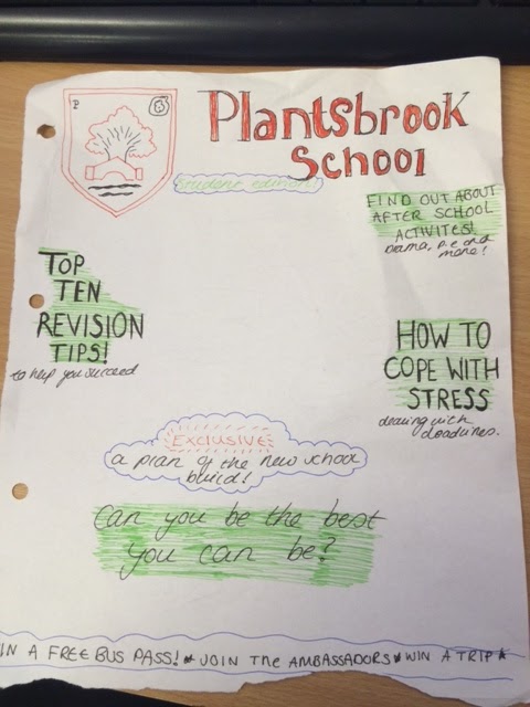
-I included the school logo as that makes it appear more formal and professional.
-Having bold fonts makes the writing stand out and therefore look more appealing to the reader.
-I chose different target markets such as parents and students as they are the ones who are most likely going to read the magazine.
- The use of the different fonts makes the mastheads more appealing along with the added text, it gives variety to the writing and so it won't look dull.

Tuesday 22 September 2015


--Colour scheme is similar
-Bold font to stand out, suits the theme of the school magazine it is. The ones aimed at parents are bold and fun, and the ones aimed towards teenagers has a sporty font. 
-Magazines are mainly aimed towards the parents of the children, sometimes at the students.
-The titles make it very clear as to what the magazine is about, which for two of them is informing parents about the school years for their child and how to make the right choices.

Thursday 17 September 2015

media technologies:

https://www.wevideo.com/highered
As I have never used this, it proved to be very interesting. Wevideo allows students to create video projects, equipt with features such as transitions, graphics, sound, text and more. These will be useful  technical skills in media in year 13 when we are making movie trailers.
Image result for wevideo

http://www.tubechop.com/
This will sure come in handy with media, as it allows you to chose a youtube video, and chop up any section required. This is useful as it will allow you to pick anything you would like to feature, that are necessary. It also doesn't require a log in, and so the hassle of that is easily avoided.
Image result for tubechop

https://www.gliffy.com/
Gliffy is another one that I looked into for media, and I feel it would be an advantage to use for the coursework, as it enables me to make diagrams to oragnise my ideas. However, the disadvantage seems to be the fact that after using it for a while, there will be a required payment.
Image result for gliffy


https://www.flickr.com/
This is a good example of a great media technology. There is free 1,000GB storage for photos, with backup. You can also edit and share any of your photographs, which will be a useful thing for when we are creating our own magazines and require our own photos. You can also view other photographers images, which is great for inspiration. 

                                                    Image result for flickr

After checking out a few different media technologies, it is clear that there are some really great websites that can be used for the coursework throughout the media stud
ies course.
Each of these magazines show either the same or different genres, as well as time period. However, each of these magazines have similarities, such as:
  • The masthead is always at the top of the cover, with the musicians photograph sometimes covering the font.
  •  the musician is the center focus on the cover, as well as their name being very visible somewhere on the cover. 
  • anchorage text supports the image
  • each magazine sports their own colour theme which is shown throughout the cover, normally to suit the artist e.g Paramore's writing is orange, just like Hayley's hair.
  •  The music magazines have the artist looking directly into the camera, as if they are looking at the reader.
  • The masthead is normally a related font to the genre, such as Kerrang and Rock Sound being rock magazines, and so their font is distorted and ruined.