Thursday 28 January 2016

Kerning and Leading

Kerning

The adjustment of the horizontal space between individual characters in a line of text. Adjustments in kerning are important in a large display and headline texts, as without kerning words can look awkward. The purpose of kerning is to create a smooth piece of text that people can read across, by putting individual spaces between the letters. kerning can be applied automatically by the desktop publishing program, and some programs allow manual kerning to make adjustments. 

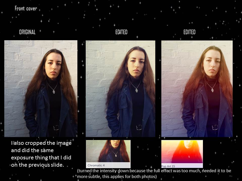
On my drafts for my music magazine front cover, I applied the kerning tool to the lettering on the feature headline, which is my artists name. 

Leading

This is the amount of space that is added between lines of text to make a document legible. This term comes from the thin lead spacers that printers used to increase space between lines of metal type. Closer leading fits more text on the page, but makes it less legible, where as wide leading make the text fill out the page and so the document is easier to read. 

Thursday 21 January 2016


I got my top 5 photos and decided to try out some editing on them on befunky. For each photo, I did two different options of editing. For the first set, I decided to keep it more natural and not overload it with effects, as it is an Indie magazine and so the look for a front cover shouldn't be too over the top of altered with, which is why I decided to only try out the exposure.  For the second set I decided to keep the same exposure levels, brightening the photo etc, but to also add on an effect. I decided to do this as she is wearing a pink coat, and so I thought it would be good to see how that would look with an effect. I tried out effects in the vintage and instant sections of befunky, as they were the best looking ones for an Indie magazine, and they were the most natural looking (kept the colour of the coat, didn't change too much of the image). Like the first photo, I wanted to keep the third one looking natural, which is why I picked the effects from chromatic and pop art, as they give a bright/sunshine effect on the image that make it a lot brighter. I wanted to keep the vintage/enhanced look about my photos that I originally stated I would in my planning. I did the same for one edit on the fifth photo, but I also put a black and white effect on it. I did this because on some images for Indie magazines, they will be in black and white and so I decided to try that out on my image too for a more vintage/old look. For the fourth image, I kept the edits simple and vintage like the first set of photos. I also tried out some edits for the double page spreads.


top 5 photos

The reason why I chose these photos to be in my top 5 is because they are all different. They are shot at different locations, range of coats, some with more makeup than others, and sometimes my model will look directly into the camera. The outfits follow the idea I was looking into on my planning, as they involve black clothing but also a statement piece, such as the pink coat, as well as the long hair with minimal makeup/eyeliner, as that'll stand out and make her look more unique. These were also the photos I was most happy with as they went the best with my planning, and I believe they are the photos that will appeal the most to my target audience.