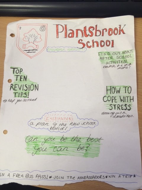
The conventions of my magazine would be the things like the masthead, as it is eye catching to the audience due to being in a black, bold font. This doesn't challenge the convention due to it being at the top of the page like a masthead normally is on school magazines, and for the masthead to be bold it will give the target audience the idea straight away of what the magazine is about. My magazine also features the school logo in the top right corner, as that will bring attention to the school and so will make it more recognizable.
I also kept to a colour scheme, which most magazines do to make it look more professional and less messy, which consists of black, red, green and white. I chose these colours for my magazine because they are the colours that are typically related to the school, and so are appropriate. The cover lines were both in a shade of green with white, with the banner having red writing. I also changed the font sizes as that would add more dimension to my magazine.
My main image does go against the conventions of a typical magazine, as it features more of the background then an actual student. I did this as I think that having the school build in the background makes the magazine look more presentable as it is showing the actual school, rather than just a student.
The target audience for my magazine would be 11-18 year old as that is the age range of people who attend the school, as so they would be the ones who are most likely to buy the magazine. My magazine is aimed more towards the students of the school, rather than the parents.
I would attract my audience by having a freebie and useful information, as this will encourage them to pick up the magazine.
Whilst making my magazine, I learnt how to use fireworks. This included learning how to add drop shadows to either images or text, and how to group the image so that it all becomes one.
Thursday, 22 October 2015

Tuesday, 20 October 2015

Thursday, 15 October 2015

Tuesday, 13 October 2015

Tuesday, 6 October 2015


Monday, 5 October 2015

Friday, 2 October 2015
Portrait
What I have learnt in photography so far that it is more complex than just taking a photo. This is because, things such as rule of thirds, depth of field, lighting, visual lead in, movement and the model position all need to be taken into account in order to create the perfect photo. All of these help create a story to the image, as with the list combined there will be specific angles and shot types that will reveal a lot about the model and what they are trying to portray.
Created with flickr slideshow.
Subscribe to:
Posts (Atom)