

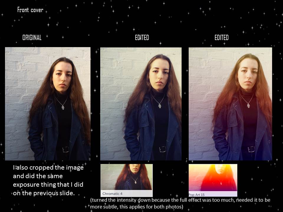


I got my top 5 photos and decided to try out some editing on them on befunky. For each photo, I did two different options of editing. For the first set, I decided to keep it more natural and not overload it with effects, as it is an Indie magazine and so the look for a front cover shouldn't be too over the top of altered with, which is why I decided to only try out the exposure. For the second set I decided to keep the same exposure levels, brightening the photo etc, but to also add on an effect. I decided to do this as she is wearing a pink coat, and so I thought it would be good to see how that would look with an effect. I tried out effects in the vintage and instant sections of befunky, as they were the best looking ones for an Indie magazine, and they were the most natural looking (kept the colour of the coat, didn't change too much of the image). Like the first photo, I wanted to keep the third one looking natural, which is why I picked the effects from chromatic and pop art, as they give a bright/sunshine effect on the image that make it a lot brighter. I wanted to keep the vintage/enhanced look about my photos that I originally stated I would in my planning. I did the same for one edit on the fifth photo, but I also put a black and white effect on it. I did this because on some images for Indie magazines, they will be in black and white and so I decided to try that out on my image too for a more vintage/old look. For the fourth image, I kept the edits simple and vintage like the first set of photos. I also tried out some edits for the double page spreads.
No comments:
Post a Comment